And I mean that literally. Newspapers, including the Sentinel, keep reducing the size of the paper to cut down the costs. The length of articles are trimmed, the comics are shrunk to molecular levels, and content is generally reduced.
Because they "don't have room" for the same amount of news they used to carry, they fire their reporters - a move akin to an airplane pilot removing pieces of the engine to conserve fuel.
So it's insulting to readers and the unemployed alike to see things like the Outlook section of today's Sun-sentinel:
While it's refreshingly uncluttered with advertising, it's glaringly uncluttered by content, too. Less than a quarter of the page serves any purpose. I can't believe that I'd rather see advertising than this, but it's true. At least advertising pays the bills. Most of this page is simply wasted. The valuable space is squandered for no reason whatsoever.
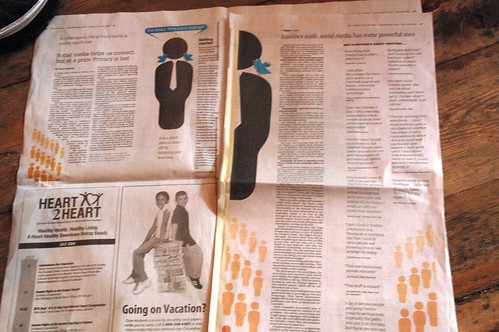
But that's just the cover; it's just as bad inside:
But that's just the cover; it's just as bad inside:
Half the page to the left is taken up by advertising. But for once, I won't complain, because at least it's serving an honest purpose: generating revenue. Of the remainder, about 25% is wasted with a pointless repetition of the logo from the front page. And to the right, no advertising, and again, at least 25% of the page is completely wasted space. It's not informing you, it's not enhancing the story, it's just another repetition of space that should have been used to serve the paper's mission: delivering news or generating ad revenue to underwrite the costs of delivering news.
The little space that is being used for content is a discussion of the benefits and drawbacks of social media. That's three pages to give us two accounts of the same damned story. And it's one that isn't particularly important; it's been covered better, and in more detail, elsewhere. This is old news. This is a colossal waste of space.
It's stunning to think that their print edition is actually worse than their website. Which only reminds me that the opinion section of the paper and the opinion section of the website have completely different names! Is there anyone who isn't an idiot at the Sentinel?
Another page turn brings us to Sun-Sentinel's Earl Maulker, telling us that in order to remain relevant, he, and most of the Sentinel staff, are now on Twitter.
Earl, I gotta tell you, 140 characters is fine for a Tweet. But a newspaper article requires a hell of a lot more. I expect pages to be full of stories, not meaningless decorative graphics, especially for what we're paying these days. This week's Outlook section is an outrage. The image is not a graph, nor is it some informative picture of people communicating. It's a slap in the face to everyone you fired, and it's a spit in the eye of your readers.
Maulker, the Tribune should can your ass and use your salary and benefits to bring back some of the real journalists who lost their jobs so some snot-nosed interns could gut what's left of the corpse of a once-proud news source.
Tweet THAT.


No comments:
Post a Comment