July 28, 2009

Tambourine Time Trip

A number of years ago, my friend Gordon and I were talking about music and influences. And he was shocked down to his toenails that Bob Dylan wasn't on my list.
"Dylan? Are you shitting me? Dylan was the best, he was amazing!"
Gordo is a few years older, and sometimes this colors us in ways to subtle to comprehend. But thanks to YouTube, I can finally illustrate why he affected Gordon, and barely got noticed by me.

First, here's Bob Dylan as he sang when I was a teen:


And here's the man who became a legend, as Gordon heard him a decade or so earlier:


After 15 years of singing it in endless repetitions, the song seems to have lost meaning for him. He stopped telling us the story, and started reciting it. And then the random pauses so the band can get in some solo licks further degrade the story.

But now I understand why author Anne McCaffrey once predicted that there would be a type of musical activism wherein a "Dylanist" would deliver scathing political commentary via song.

And Gordon? You were right; Dylan totally rocks!

NBC 6 Sets New Benchmark for Poor Taste (updated)

Rick over at South Florida Daily Blog called it "Stupid Headlines R Us," so I had to see it.


Wow. This is worse than stupid. It's thoughtless. There's nothing remotely funny about this story.
...the animal was probably still alive when chunks of its chest and legs were sliced off by the illegal butchers. Then the horse was lit on fire near its stable.
I don't know who is writing the headlines for NBCMiami; it probably was NOT reporter Todd Wright. But whoever wrote it, they ought to be sent out to help clean up the dead horse. That'll give them perspective on what is and isn't funny.

Shame on NBCMiami for not only coming up with it, but actually using it, and then letting it stay up.

UPDATE:
At some point in the day, they did change the title, but the URL still tells the tale:
nbcmiami.com/news/local-beat/Another-Miami-Horse-Becomes-Mr-Dead.html


July 26, 2009

Sun Sentinel: A Waste of Paper

And I mean that literally. Newspapers, including the Sentinel, keep reducing the size of the paper to cut down the costs. The length of articles are trimmed, the comics are shrunk to molecular levels, and content is generally reduced.

Because they "don't have room" for the same amount of news they used to carry, they fire their reporters - a move akin to an airplane pilot removing pieces of the engine to conserve fuel.

So it's insulting to readers and the unemployed alike to see things like the Outlook section of today's Sun-sentinel:
wasted space

While it's refreshingly uncluttered with advertising, it's glaringly uncluttered by content, too. Less than a quarter of the page serves any purpose. I can't believe that I'd rather see advertising than this, but it's true. At least advertising pays the bills. Most of this page is simply wasted. The valuable space is squandered for no reason whatsoever.

But that's just the cover; it's just as bad inside:

more wasted space

Half the page to the left is taken up by advertising. But for once, I won't complain, because at least it's serving an honest purpose: generating revenue. Of the remainder, about 25% is wasted with a pointless repetition of the logo from the front page. And to the right, no advertising, and again, at least 25% of the page is completely wasted space. It's not informing you, it's not enhancing the story, it's just another repetition of space that should have been used to serve the paper's mission: delivering news or generating ad revenue to underwrite the costs of delivering news.

The little space that is being used for content is a discussion of the benefits and drawbacks of social media. That's three pages to give us two accounts of the same damned story. And it's one that isn't particularly important; it's been covered better, and in more detail, elsewhere. This is old news. This is a colossal waste of space.

It's stunning to think that their print edition is actually worse than their website. Which only reminds me that the opinion section of the paper and the opinion section of the website have completely different names! Is there anyone who isn't an idiot at the Sentinel?

Another page turn brings us to Sun-Sentinel's Earl Maulker, telling us that in order to remain relevant, he, and most of the Sentinel staff, are now on Twitter.

Earl, I gotta tell you, 140 characters is fine for a Tweet. But a newspaper article requires a hell of a lot more. I expect pages to be full of stories, not meaningless decorative graphics, especially for what we're paying these days. This week's Outlook section is an outrage. The image is not a graph, nor is it some informative picture of people communicating. It's a slap in the face to everyone you fired, and it's a spit in the eye of your readers.

Maulker, the Tribune should can your ass and use your salary and benefits to bring back some of the real journalists who lost their jobs so some snot-nosed interns could gut what's left of the corpse of a once-proud news source.

Tweet THAT.

July 24, 2009

The Sun-Sentinel: New Levels of Suckitude.

I try. I want to enjoy my local paper's website, I really do.

But the Sun-Sentinel website is such a lousy steaming pile of shit that it's impossible to ignore how bad the site is.

Take this, from the today's homepage:


Oooh. Inviting. I take a drink now and then. I'm up for trying out a new place. Let's see what they got:


Hmm. Nothing about a "good pour" here; Lil Kim, some asshole named "Pharrel" (he's an asshole because he doesn't spell it with an "F"), Broke I mean Brooke Hogan, blah blah blah, nothing about a good pour here.

Oh, wait, the "improved" Sun-Sentinel tends to put critical stuff "below the fold." After all, why put the story you want up top where you expect, when they can make you scroll and scroll and scroll....


Nope. Nothing relating to the link I clicked on AT ALL. Just when you think the Sun-Sentinel could not suck any more than it already does, it goes and sucks more.


July 19, 2009

Media in the 21st Century: Beat Sharing, Illustrated

Once upon a time, in a more enlightened era, great journals competed to bring readers exclusive stories of the day. They were locked in a struggle, perpetually trying to "scoop" each other, to find news before their nemeses even knew anything was happening.

Not anymore! Now, the papers have fired virtually all their reporters, holding on to a few recent grads interns who never heard of The Front Page http://en.wikipedia.org/wiki/The_Front_Page or saw His Girl Friday,( but did see the incredibly bad re-make with Burt Reynolds and Kathleen Turner that co-starred Superman(, and practice "beat sharing," where instead of each paper covering all the "beats," they each cover their own neighborhoods and pass the stories back and forth, kind of like you did with homework in 5th grade.

Here, we see the Miami Herald sharing the day's news with the Sun-Sentinel....
It's on their website and in your Sunday paper as we speak. As you can imagine, they save a lot of money doing this!

Remember Shirttail Charlie's?

Right on the river, across from Riverfront, it was a great place for a burger and brew. Well, good news: a new restaurant just opened, and it's hopping:It's now The Pirate Republic. And yes, it's run by the same group that has the place over on the beach.

I haven't eaten there yet, but it's only a matter of time...

July 15, 2009

I'll pass on the milkshake.

A California contest for new ice cream flavors announces a winner: bacon.

http://blogs.creativeloafing.com/theclog/files/2008/10/baconicecream2.jpg

That's right, bacon flavored ice cream. The runner up was Jalapeno Cream Cheese with Raspberry Swirls. Read about it on the TurnTo23.com website.

July 11, 2009

Grandma Turns 91

My grandma turned 91 today.  She sounded a little tired on the phone, but she'd spent the day out at my aunt's, surrounded by great-grandchildren.

She's pictured here performing in one of those "senior follies" things they did a couple of years ago.  Only two performers had a background: my grandmother started on Vaudeville at age 2, with my uncle Win: together they were "Winnie and Ginnie, the Tibbitt Twins!  Sweet songs and soft-shoe!"  This was a followup to my great-grandfather's act, "Willy-Nilly Tibbitt, Snappy Dance and Natty Patter."  (No, they were not twins.  Great grandad was big on marketing.)

Uncle Winn never took a shine to it, but my grandmother pursued acting and singing her whole life, although she never quite managed to make a career out of it.  South Florida audiences may remember her turn as Granny in the Actors' Rep production of Going to See the Elephant

She met my grandfather when he directed her in some lightweight comedy back in 1938.  He was home from college, and a buddy asked him to direct a play at the Haddonfield Plays and Players.  He agreed, on the condition that they find "real knock-out" to play the ingenue.  Enter grandma. 

They stayed active with the Plays and Players for years, directing and appearing in shows. My grandmother appeared in or directed shows with Michael Landon, a nice Jewish boy from Collingswood, and Judith Light, from Burlington. Everyone wanted to perform with the Haddonfield Plays and Players in those days.

She was asking me if I had anything to do with casting the shows coming in to my theatre.  When I explained that I did not, she wilted for a second, then said, "Well, if you know of anyone casting an old lady, give me a call!  I've got to get out of Iowa for bit.  I can't get through a conversation without it turning to to football!"

And she'd be great.  At 91, she's as sharp as ever.  She churns out short stories and children's plays for the Sunday school market, which is neither lucrative nor a road to fame, but she likes it.

DSC_4978
Happy Birthday, Grandma!


July 7, 2009

Sun-Sentinel: VIEWS layout lacks Vision.

Geez, the individual pages look so pretty that I really want to like the new website. But I can't. It's a skin-deep makeover, and as soon as you click some links you discover that the pretty new website is a decaying corpse. I am appalled at the poor quality of this makeover. Just when I think it couldn't possible get worse, it does.

I like opinion and analysis, so in an attempt to give the drooling idiots at Sun-Sentinel a chance, I click on the VIEWS tab, which in most places allows you to set text, color palettes, and so on, but some clueless nitwit thought it would be a cool name for the Opinion section, because Opinion is so, you know, accurate.

And accuracy seems to be just a word at this exciting new Sun-Sentinel.

Let's take a look at the top of the page:


"Ideas and Opinions from South Florida." OK, I'm down with that. They should dump the "Views" moniker and call it this. So, what are the South Florida Ideas and Opinions at the top of the lise?

Civics, with a picture of Bob Graham. OK, that works.

The Everglades, a photo gallery guide... which has no place on an Ideas & Opinion page, but makes sense if "Views" is supposed to be a collection of images, which frankly makes more sense than the way they're using it now. But the gallery offers neither ideas nor opinions, and belongs somewhere else.

Al Franken? WTF? Al Franken is not from South Florida. But it's not ABOUT Al Franken, it's BY Al Franken! The article has nothing to do with South Florida. And that picture isn't Al Franken. I have no idea who that person is, and clicking through only deepens the mystery. This is a MASSIVE fail, and we're only at the tippy-top of the page! This doesn't bode well: 2/3 of the content so far is crap.

It's followed by a list of titles. No explanation is given about the nature of these articles, or their origin. But clicking through, you discover that each of the eight titles is an editorial. Several of them are over a week old.

Scrolling down, we get Chan Lowe's blog, presumably so they can double the fist article with a cartoon to emulate the print version. Eh. He offers opinions, I guess it works.

Next, we find "Letters." Are these letters to the editor? From the editor? It doesn't say. Like so much else in the brave new, new and improved, updated Sun Sentinel, the reader has to guess. I'd like to peruse all the letters to the editor. On other sites, not only are letters to the editor properly labeled letters to the editor, at the bottom of the little section there's a link to "more letters."

But that's just, you know, something good papers do. Good papers also let you look at yesterday's letters, and even letters from the past 7 days. Not the Sun-Sentinel! You'll see today's pathetic offering, and THAT'S IT! Want stale opinions? Scroll back up to the unlabeled editorials!

Continuing, we find another blog, TALK BACK SOUTH FLORIDA. It lists the titles of a few blog posts. Want to click through to the entire blog? Tough, because the Sentinel isn't interested in allowing you to do THAT.

Next we come upon COMMENTARY. A small selection of titles, but no explanations. Is this more letters? Something else? We don't know. Guess. WRONG! Guess again. WRONG AGAIN! HA HA! WE FOOLED YOUR SORRY ASS!

It's columnists. Each title is by a different syndicated columnist. You can only discover this by clicking on the link, going to the article, and scrolling all the way down to the bottom of the column. In a good paper, you have a page dedicated to just the columnists, and it's laid out so you can see which columns are by which columnists. But in the crass world of the Sun-Sentinel, one columnist is much like another. The Wii-playing interns that make up the web design team don't know the difference, why should you?

And after the cleverly hidden Columnists, we have .... MORE EDITORIALS! They're even clearly labeled as such. Actually, they're called MORE RECENT EDITORIALS. But they are stinky-old. You can't see yesterday's letter to the editor, but you can read last month's stale opinion that has been washed away by the tide of developing events.

I never thought I'd find myself pining for the old Sun-Sentinel website.


July 5, 2009

Sun-Sentinel: Topix Removal Turns Toxic

The Sun-Sentinel seems to have severely underestimated their readers. Browsing their Feedback page, you find the same complaints again and again, despite the moderator's best attempts at hiding the facts.
  • They hate the basic format
  • They hate the way the website is "organized."
  • But most of all, they hate the fact that Topix was removed.
Topix provided the anemic Sun-Sentinel with a much-needed illusion of vitality. Readers could comment on whatever paltry stories they found of interest in the rapidly dissipating paper, and interact effectively with each other, debating issues they found important.

It went far beyond simply allowing a user to append a few words about a story: they could respond directly to each other, they could quote portions of each other's comments to help make the discussion more coherent, and they were given ample space to write their thoughts. It gave readers the impression that the Sun-Sentinel was fostering discussion of important events of the day.

It's an impression that increasingly appears to have been false.

Angry readers keep demanding to know what happened to their Topix accounts, and all the discussions that they were participating in when Sun-Sentinel pooped out the "improved" website.

When Topix tried to inform Sun-Sentinel users that their Topix accounts were still active, staffers were quick to claim it was "spam" and removed.


The Sentinel staff claims they have discontinued Topix to replace it with something better. But the fact is, they didn't replace it with something better. They didn't replace it with something that's as good. In fact, they barely left the ability to leave comments at all. Many articles don't permit comments at all, and the few articles that do have a tool so inadequate that it can't even keep up with typing, and cuts the user off after a few sentences, it's obvious that there has been only regression. Matt Sokoloff and his team keep talking about it, but the feature doesn't appear to exist beyond staff's claims that does.

The Sun-Sentinel has refused to respond to the entirely reasonable question "why did they removed a popular feature without having a suitable replacement available to it?" It seems blisteringly obvious that if the new system isn't available, the old one should be left in place until it is. But grasping the obvious doesn't appear to be a condition of employment at the Sun-Sentinel's IT department.

It seems that while the website team for the Sun-Sentinel have bamboozled management, soon-to-be-former Sentinel readers are not so gullible.

They know when they're being fed a line of BS.


July 3, 2009

Coincidence?

Michael Jackson dies, and before the week is out, we see this headline:


Rumors have been going around for years that Jacko had been replaced by a Disney robot.  But he dies, and days later, an African-American robot turns up in Disneyworld?  Sure, fine, all that plastic surgery and he hardly looked like the black man he had born, but maybe that just means his robot duplicate was relegated to the closet?

I'm just saying it's an interesting coincidence, is all.


Sun-Sentinel: Well, DUH.

This story was in the July 3 online edition:


Really?  Why, the next thing you know, they'll tell us that someone who was beaten to death died of blunt force trauma!

Sun-Sentinel; All The News We Can Hide Away

Before I dig into the problems with the Sun-Sentinels' new website, I want to comment on what they did right: the basic layout of the individual pages. Overall, those pages are much improved over the old site. Could they stand some improvement? You bet! But it's still better than what it replaced, even with the way the pages lurche when you're scrolling through them.

It's in site navigation that the Sun-Sentinel falls flat on its face. And let's face it: if you can't find what you're looking for, you go somewhere else.

The thing is, it should be a no-brainer. Newspapers have been organizing stories into sections for a couple of hundred years.

The traditional sections:
Major News
- stories with the widest impact or importance, National and International stories.
Local News
- stories that hit close to home
Entertainment
- everything to make you happy
Opinion
- what people think about the news
Sports
- nuff said
Business
- investments, stocks, discussions of the business world
Real Estate
- what to look for, hot deals, good neighborhoods, listings.
Home & Garden
- taking care of your family: food, fashion, health advice, and so on.

Seems pretty familiar, yes? Let's look across the Navigation bar for the "new and improved" Sun-Sentinel:


In case you have a hard time seeing the picture (stop using Internet Explorer!), the options are:

HOME
NEWS
BROWARD
PALM BEACH
DOLPHINS
SPORTS
LIFE&FAMILY
MONEY
GOING OUT
HEALTH
VIEWS

Now, which of these leads to the TV listings? It's not under "News". It's not on the "Home" page. It's not in "Views." "Going Out" seems to have replaced "Entertainment," but of course, you don't "go out" to watch TV, which you usually do in your living room. And naturally, the TV listings are not there.

It seems to me that there must have been some discussion of where to put the TV listings, since there's no really obvious place to put them anymore. And it seems to me, that when they realized it didn't fit into an entertainment section labeled "Going Out," there should have been some discussion of the dubious wisdom of sticking with that label.

Instead, they stuck TV listings and articles in "Life&Family."

Let's look for a new house! A new house for our Family to spend its Life watching TV.

Let's look over that menu bar:
HOME
NEWS
BROWARD
PALM BEACH
DOLPHINS
SPORTS
LIFE&FAMILY
MONEY
GOING OUT
HEALTH
VIEWS

Hmm, no Real Estate section. It's not under "Life&Family." It's not under "Broward" or "Palm Beach." Wait, "News" has "Condos and "HOAS." No, "HOAS," not "WHORES." Don't sweat it, natural mistake. Hmm. This leads to a list of stories by Daniel Vasquez. Wait, what's that at the top of the list?


OK, so we click on "Realestate" which takes us...to a big page labeled "Real Estate." It's a subset of Business. Hmm, there's no "Business" section, but there's "Money" so....we click on that.

MONEY:
Your Career
It's Your Money Blog
House Keys Blog
Personal Finance
Bargains
Business
Consumer Blog
Real Estate
Condo & HOAS.

I suppose that Real Estate does have some financial ties. But if you're looking for a place to live, you might not be thinking along those lines. If I want to rent a place, can I find that here? No? So where are the Classifieds? OH, they're a submenu of HOME.

On the Feedback page, a lot of people complained about not being able to find Palm Beach or Broward News stories. That's because they were looking in NEWS, instead of the big BROWARD or PALM BEACH menus on the navigation bar.

So mouse-over those bars: You end up with a list that exactly coincides with those weekly Community sections the SS tucks into appropriate editions. It's easy to conclude that that is the purpose of those buttons.

They have put them back under NEWS, too.

So what else is under NEWS?
Weather
Hurricane HQ
Obits
Traffic
Schools
Florida
Nation/World
Condos & Whores, em, HOAS
Blogs
News Tips
Broward County
Palm Beach County

Why is "Condos & HOAS" here? "Blogs?" Let us see what they say about "Blogs;"
About our blogs
On our blogs (short for "web logs"), Sun-Sentinel journalists escape the confines of the printed page and newspaper production schedules, and publish immediately on the World Wide Web.
We keep you current every day with the latest news and sports, the liveliest features and opinion.
Interesting. Why don't they just publish the news stories into news? I mean, they are a news paper, aren't they? Isn't this the entire reason they exist? They have to shunt the best and latest news into a blog? Really? No wonder they're going tits-up losing readers. I'm not opposed to blogs, but they work better as opinion or "color," not the guts of the paper.

Not sure why they need the Dolphins on the menu bar, when they are already listed under Sports.

But then, the goobers at the Sentinel also tucked "travel" under "Life & Family" instead of "Going Out." After all, I'm pretty sure you have to leave the house to travel...Just like you have to spend Money to shop, and yet the Shopping Blog is also under "Life & Family."

Also under "Going Out," we find the Gambling Blog, which should absolutely be under Money. Music is also under "Going Out." Well, if it's concerts, I guess that makes sense, but you don't necessarily "go out" to listen to tunes on your CD/MP3 player... and hey, where have they hidden the book reviews?

Under "Art/Stage." You are supposed to magically know that the Sun-Sentinel staff believes that this is a clear label for "culture," which of course includes books.

There's no explanation of why HEALTH isn't a subset of Life & Family; it has no sub-menus, which to me is a clear indicator it should not be its own section. But wait, CNN has a Health Section, or actually a "Dr. Gupta Says..." section. So I guess that's why: because CNN says.

So we're down to VIEWS. Which, logic dictates, is where all the photo galleries are...what the-! There are no VIEWS at all! It's all opinions!

So this is where they hid the Opinion section. Why call it "Views," which has other meanings, when you could call it "Opinion," which is pretty specific to what's being publishing there?

Keep it clear, keep it concise. Give us sections with logical names, with a logical set of sub-categories under them. Don't make us dig around to find the stories we want: because frankly, it's a lot easier to go the the Herald and Post than to dig around the jittery mess you've made of your website.

And honestly, I'd rather have the old website and most of the reporters you fired. I'm tired of discovering stories I read elsewhere, and earlier. It's not news if I've read it somewhere else, first.

July 2, 2009

Sun-Sentinel: How to Skew Feedback to Impress the Boss

As you might have heard by now, the Sun-Sentinel has re-vamped its look. Each page is moderately easier to read (if you have really good eyesight) but site navigation is in the dumps. (More on that later).

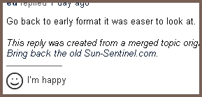
Worse, they've chosen to use GetSatisfaction to track customer feedback, probably the most annoying webtool since the pop-up add. Forget about the stick-in-the-eye tab that sticks out of the right side of the screen, scrolling with the window so you can't ignore it, threatening to leap out at the slightest mouse-over. No, the worst part of GetSatisfaction is that it's designed to spin customer complaints so they look like positive feed back. It's really intensely evil.

So how do the do it? Let's look at the top of the feedback form:


Note that you have exactly four options, and complaining isn't one of them. You can ask a question, share an idea, report a problem or give praise. So what's wrong with that? Well, say you're a board member, and you want to know how your readers are filling out the feedback forms: primarily, you want to know how many complaints there are. And guess what? There aren't any. I know, you think I'm nitpicking. I'm not.

You can't register a complaint. So what can you do?


Questions are good: that denotes interest in the production. It indicates people want to know more. People care enough to aske


Shared ideas mean that people are taking ownership of the website: they really want to get involved. They care enough to share.


Problems can be addressed: problems are usually things like "the link is broken" and "the page is missing" which you expect when you change format. But problems means the team can fix things. "Well done, team!"


Give praise says it all. You love the product.

As you can see, right off the bat, the entire thing is skewed to indicate positive feedback.

But it gets worse.

GetSatisfaction offers another feature: it gauges the emotional state of the respondent. After you fill out the field with your question/idea/problem/praise, you scroll down to this:


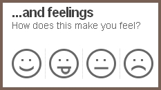
This is where the designers of GetSatisfaction get insidious, and really screw over the reader and make the web designer look brilliant. A lot of people skip over tags; no big deal, you said what you wanted. And if they look to the right, they see emoticons.

How does "this" make you feel? What is "this?" It doesn't say. "Well, I'm happy that you're letting me give you feedback. I feel good about that."

And the damage is done. 168 support topics, most of which are complaints, and according this evil little tool, everyone's happy about the new Sun-Sentinel website.


They're happy about the fonts they can't see, they're happy about the pages they can't find, they're happy about things they find horrible:


So upper management asks the web design team how things are going, the design team shows management these GetSatisfaction results that are little more than fantasies, and six months later, the Sun-Sentinel lays off the 6 actual reporters they still have working for them, while blaming people for just not being interested in news anymore.

And we, the readers, get screwed again.


July 1, 2009

It Wasn't Ron.

Remember when I pointed out that death occurs in threes, and then discovered that only two spokesmen ( Ed McMahon and Bill Mays) had died?

Well, Ron Popeil can rest easy.

Karl Malden is dead.
His film credits ...include an Oscar-nominated turn in On the Waterfront, as well as roles in such movies as Birdman of Alcatraz, How the West Was Won, and the 1962 movie adaptation of Gypsy, in which he played Herbie. He earned four Emmy nominations for his leading role in The Streets of San Francisco, and won an Emmy for the miniseries Fatal Vision.

He was also well known to TV viewers for a long-running American Express ad campaign in which he popularized the phrase, "Don't leave home without it."
- TheatreMania.com